File:Mosaic-big.png
Mosaic-big.png (600 × 450 pixel, dimensione del file: 24 KB, tipo MIME: image/png)
| Questo file e la sua pagina di descrizione (discussione · modifica) si trovano su Wikimedia Commons (?) |
Dettagli
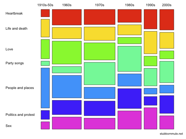
| Descrizione |
English: Mosaic plot showing cross-sectional distribution through time of different musical themes in the Guardian's list "1000 songs to hear before you die". This chart first appeared in the blog post "Love is Old-Fashioned, Sex Less So" on A Stubborn Mule's Perspective. |
| Data | |
| Fonte | Opera propria |
| Autore | Seancarmody |
The graphic was originally created by Sean Carmody for A Stubborn Mule's Perpective, using the R statistical project. The program that generated the graphic is given below; the data was sourced from the Guardian, saved as a CSV file called "1000.csv" and slightly edited to clean the data (some years were formatted in the original source as currency). Note also that there are, in fact, slightly fewer than 1000 songs in the list and a few of them are duplicated in different categories.
There were not many songs in the list prior to the 1960s, so they have all been grouped in a single bin for the mosaic plot.
data <- read.csv("1000.csv", as.is=c(FALSE, TRUE, FALSE, TRUE, TRUE))

data$DECADE <- floor(data$YEAR/10) * 10
data$BAND <- paste(data$DECADE, "s", sep="")
data$BAND[data$DECADE < 1960] <- "1910s-50s"

plot(table(data$BAND, data$THEME), col=rainbow(7), las=1, main="")
Licenza
- Tu sei libero:
- di condividere – di copiare, distribuire e trasmettere quest'opera
- di modificare – di adattare l'opera
- Alle seguenti condizioni:
- attribuzione – Devi fornire i crediti appropriati, un collegamento alla licenza e indicare se sono state apportate modifiche. Puoi farlo in qualsiasi modo ragionevole, ma non in alcun modo che suggerisca che il licenziante approvi te o il tuo uso.
- condividi allo stesso modo – Se remixi, trasformi o sviluppi il materiale, devi distribuire i tuoi contributi in base alla stessa licenza o compatibile all'originale.

|
È permesso copiare, distribuire e/o modificare questo documento in base ai termini della GNU Free Documentation License, Versione 1.2 o successive pubblicata dalla Free Software Foundation; senza alcuna sezione non modificabile, senza testo di copertina e senza testo di quarta di copertina. Una copia della licenza è inclusa nella sezione intitolata Testo della GNU Free Documentation License. |
Cronologia del file
Fare clic su un gruppo data/ora per vedere il file come si presentava nel momento indicato.
| Data/Ora | Miniatura | Dimensioni | Utente | Commento | |
|---|---|---|---|---|---|
| attuale | 06:42, 26 lug 2009 | | 600 × 450 (24 KB) | Seancarmody | {{Information |Description={{en|1=Mosaic plot showing cross-sectional distribution through time of different musical themes in the Guardian's list [http://www.guardian.co.uk/news/datablog/2009/mar/20/1 "1000 songs to hear before you die"]. This chart firs |
Pagine che usano questo file
La seguente pagina usa questo file:
Utilizzo globale del file
Anche i seguenti wiki usano questo file:
- Usato nelle seguenti pagine di de.wikipedia.org:
- Usato nelle seguenti pagine di en.wikipedia.org:
- Usato nelle seguenti pagine di en.wiktionary.org: